
We all wonder what makes a scientific poster look good, don’t we?
It is indeed hard and often frustrating to create excellent scientific posters without actually even knowing how to start. This is not science but graphic design. Shouldn’t it be taught in the university in order to avoid leaving so many students and PhDs struggling on their own? After all, not everyone is naturally creative.
„Don’t try to be original, just try to be good.” -Paul Rand
Graphic Design is not hard! Surprised? Don’t be. Because design is based on how we perceive the world around us, you already know the main aspect of design compositions. You just need to become more aware of those perceptions. Leave out originality (at least at the beginning) and focus better on perception in order to set the basis for a scientific poster. It is indeed so easy!
But, which perceptions should you consider?
Use the eyes’ natural scan paths to better attract the readers’ attention
Our eyes don’t see every single letter in a word nor every single word in a sentence. Our eyes skip along the text in small jumps called saccades. After each saccade comes a pause when the brain takes a snapshot and arranges the letters into words. Those pauses are called fixations. During each saccade everything is blurry which means we do not receive any visual information. If you are interested in finding out more then have a look at the book Detail in Typography by Jost Hochuli.

inspired by the book Detail in Typography by Jost Hochuli
We don’t only read text in this way but we also look at images and whole layouts following the very same scan paths. Saccades and fixations make up the scan paths ours eyes are following right now while reading this text and looking at this website.
Renbrandt created a composition in which all axes are pointing at the main dark figure on the right who is performing the main action. Having that in mind it is possible to predict the main saccades and fixations one’s eyes would follow. Olivier Le Meur did a research in observing people when looking at Renbrandt’s painting. He then created an exact heat and scan map similar to the one on the right.
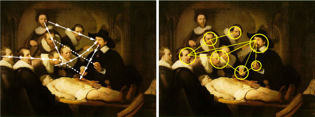
1. Axes pointing at the main figure on the right and his action 2. Possible saccades and fixations based on the axes
Because we see so little and only for a very short period of time (about 3 fixations each second), we must make the most out of it.
The Gutenburg diagram shows how we scan a layout that has homogeneous information without a strong hierarchy and consists mainly out of text. Because we are trained to read from the top left to the bottom right, we instinctively “read” a composition starting from the top left down to the bottom right.
How are scan paths used to design posters and reach harmony?
-
Decide which elements are most important for you and place them on scan paths so they can naturally get more attention. This is in harmony with the natural way we scan any layout.
- Place less important information in the bottom left and top right, areas which get less noticed. If you want to attract more attention to those spots enlarge visuals or highlight phrases using font styles or colors. Those are secondary areas and they shouldn’t compete against the main scan path.
- Build in pauses so the eyes and mind can rest. Leave space between lines, use graphics to break a big paragraph into smaller parts, leave white space intentionally.

1. The scan path when we look at a layout that has a homogeneous hierarchy 2. Using the scan path to create a poster layout
Use the way we read text to arrange the poster’s elements correctly
How do we read text? From left to right. And how do we “read” images and whole layouts? Again from left to right. Because we are so used to starting at the left side of a page, we do it automatically even if there are images instead of text.
The following automatic process takes place within about 5 seconds every time we have a look at magazines, pictures, posters, presentations etc. At first our eyes are fixed at the left side of the page (if there is no predefined visual center). Then our attention is immediately attracted by the object which is most attractive (usually this would be any kind of a visual), followed by the second most attractive object (another visualization or a big colorful title). This can continue depending on how many objects there are. Now is the time when we weight if what we saw is beneficial to us and decide if we are willing to engage more with the information on this page.
Before we move on to the next layout we have one very quick fixation at the right down corner of the page. Why? Because it is a reflex we do when we finish reading one page and want to turn it over. Again, this happens automatically and it doesn’t matter if we are actually reading or just looking at a visualization.

1. Applying the Gutenburg diagram and the way we read to create a harmonious layout 2. Common mistakes which are not in harmony with our perceptions
Use the brain’s preferences to create eye- catching poster elements
The order in which the elements of a layouts are perceived is based on what the brain finds valuable as information. The more interesting a piece of information is, the more likely it is to be processed by the brain. Interesting not to an intellectual human being but to a prehistoric man. Things that are directly connected with our survival are rated as more interesting than others which have no connection at all.
Our eyes never start with the title on a page, go to the next element, read everything word for word, look at every single graphic and end at the right bottom. You can try to do it yourself and see how unnatural it feels. We are not designed to perceive every piece of information that is in front of our eyes.
The brain prefers images to text and within an image it focuses firstly on people and secondly on animals and landscapes. Big elements are noticed quicker than small one. Eye- catching objects have better chances to be noticed than others that are less attractive. Colors are always preferred by the brain.
These are five quick ways how to use the information about the brain’s perception in order to improve the poster design:
-
Use images (especially at the beginning and at the end) to attract the readers attention
-
Use good and attractive images which leave a pleasant feeling and can be remembered easily
-
Don’t overload any visualization with information. The less we see, the more we understand.
-
Make all images big enough. Zoom in onto the elements of the graphics if possible.
-
Use colorful instead of black and white visualizations whenever you have the chance.
Use the force of gravitation to achieve a balance in your poster composition
We are tightly connected to the nature around us on a conscious and subconscious level. Ever since we were little we know that everything can fall and even birds must come back to/on the ground. The process of learning how to walk is influenced by the law of gravitation. Our sense experience is connected to the gravity every day of our lives.
On this scale the large red box appeals much heavier than the smaller yellow one due to its size and color. In the first case the red box is positioned in a way that enables equilibrium but in the second example the scale is unbalanced. The force acting on the red box is gravity and is acting downwards. In the third case the scale is again balanced with the help of a dark small box.
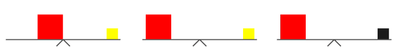
1. balanced 2. unbalanced 3. balanced
The physical balance can be translated into a visual balance when a poster is being designed. What looks unbalanced must be balanced using visual weight: the perceived weight of a visual element. This is a measure of how an object attracts the viewer’s attention.
Some of the things which influence the visual weight are:
-
shape: regular and compact shapes appeal heavier
-
size: large objects are visually heavier; zooming into an object has the same effect
-
color: warm colors are heavier than cool ones; colorful objects have more weight than pale ones
-
value: dark objects have more weight than light ones
-
orientation: a vertical object appear to be heavier than a horizontal one
-
positioning: an object in the upper part of a page has more weight than one in the lower part

1. unbalanced size, value, orientation and positioning 2. balanced poster layout
Squeeze your eyes together or step away from your poster and have a look at the layout. Look at it in terms of colorful boxes which are forming a composition. Your job is to balance that composition.
Start creating your excellent scientific posters today using the following 4 perceptions: the eyes’ natural scan paths, the way we read text, the brain’s preferences and the force of gravitation.
Don’t forget to have fun ;).
–
Anna
P.S. If you too want to master graphic design and gain control over your personal scientific visualizations, then it is time to take some action. Don’t miss out on the latest graphic design techniques and get an instant access to more resources by subscribing.
You have a challenging cover or visualization you are currently working on? Work with us! We can help you express your ideas in a better way. Contact us today!
Are we connected? Get more inspiration by Hamiltonian Of Design on Facebook, Twitter and Pinterest.
